- JMP User Community
- :
- Discussions
- :
- Overlayed Histogram and Set Binning
- Subscribe to RSS Feed
- Mark Topic as New
- Mark Topic as Read
- Float this Topic for Current User
- Bookmark
- Subscribe
- Printer Friendly Page
- Mark as New
- Bookmark
- Subscribe
- Mute
- Subscribe to RSS Feed
- Get Direct Link
- Report Inappropriate Content
Overlayed Histogram and Set Binning
Hi,
I'm using histogram for comparing two sets of data. I find below list may produce very good representations, just wondering if this is possible with JMP/JSL.
Thanks in advance!
a) Able to overlay plots using graph builder, but would be nice if distribution "lines" would be added like on the attached image
b) how to set number of bins, say 100 or 200 without messing up the x axis labels (happens when adjusting increment)
- Mark as New
- Bookmark
- Subscribe
- Mute
- Subscribe to RSS Feed
- Get Direct Link
- Report Inappropriate Content
Re: Overlayed Histogram and Set Binning
Interactively, use Graph Builder. I will demonstrate with Big Class.
Drag Height to the x-axis.
Change the graphing element to Histogram.
Drag Sex to the Overlay region.
Click Done.
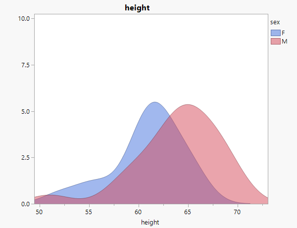
Personally, I am not a fan of overlaid histograms. The overlapping bars hide too much. Fortunately, Graph Builder allows you to switch from bars to the kernel density:
This is clearer to me at least.
I figured out how to get them overlaid, but I am not very happy with the look.
I used the kernel density picture shown above. I then right-clicked the graph and chose Edit > Copy Frame Contents.
Now switch the picture back to the bars.
Right-click the graph and choose Edit > Paste Frame Contents.
< last picture doesn't seem to be displaying so I have attached it>
There are likely some ways to make this prettier, but I have not spent any time looking into that.
Finally, you could use Distribution and a similar trick (Copy Frame Contents and paste into the other graph) to overlay the histograms. You may want to play with the proper shading and such so that the graph is legible). The advantage with Distribution is that you could get a distribution fit (rather than a kernel fit). Plus, the distribution platform allows you to specify the bin width, which will not "mess up" the x-axis.
- © 2024 JMP Statistical Discovery LLC. All Rights Reserved.
- Terms of Use
- Privacy Statement
- About JMP
- JMP Software
- JMP User Community
- Contact


