This website uses Cookies. Click Accept to agree to our website's cookie use as described in our Privacy Policy. Click Preferences to customize your cookie settings.
- JMP User Community
- :
- Discussions
- :
- kernel control chart
Turn on suggestions
Auto-suggest helps you quickly narrow down your search results by suggesting possible matches as you type.
Topic Options
- Subscribe to RSS Feed
- Mark Topic as New
- Mark Topic as Read
- Float this Topic for Current User
- Bookmark
- Subscribe
- Printer Friendly Page
- Mark as New
- Bookmark
- Subscribe
- Mute
- Subscribe to RSS Feed
- Get Direct Link
- Report Inappropriate Content
kernel control chart
2 weeks ago
(169 views)
Hello.
my question is how can I fit a kernel density plot for my predictive model residuals in a way that first identifies and removes outliears data points, and then presents the final kernel plot with no outliears data along with its confidence bounds and shape?
1 REPLY 1
- Mark as New
- Bookmark
- Subscribe
- Mute
- Subscribe to RSS Feed
- Get Direct Link
- Report Inappropriate Content
Re: kernel control chart
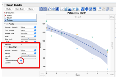
There are multiple ways to identify putative outliers. Once the rows with outliers are identified, use the hide and exclude option to remove them from calculations and hide them from graphs.
What you're looking for isn't a "Control Chart" but something like a Run Chart.
Try using Control Chart Builder"
JMP Systems Engineer, Health and Life Sciences (Pharma)
- © 2024 JMP Statistical Discovery LLC. All Rights Reserved.
- Terms of Use
- Privacy Statement
- About JMP
- JMP Software
- JMP User Community
- Contact


