- JMP User Community
- :
- Learn JMP
- :
- Hands-On Activities
- :
- Graph Builder Hands-on Activities Solutions
- Subscribe to RSS Feed
- Mark as New
- Mark as Read
- Bookmark
- Subscribe
- Printer Friendly Page
- Report Inappropriate Content
These hands-on activities allow you to practice building graphs in JMP using Graph Builder. This post contains the Graph Builder hands-on activities, the data, and a PDF file of these solutions in English.
Level 1
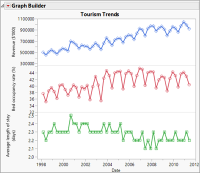
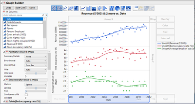
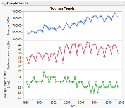
1. Open the Australin Tourism data table and create the following graph.
a) Open Australian Tourism.jmp.
b) Select Graph > Graph Builder.
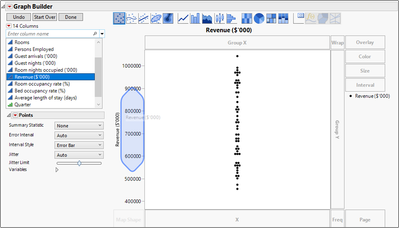
c) Select Revenue ($’000), then drag it to the Y zone.
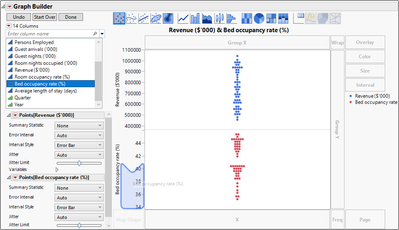
d) Select Bed occupancy rate (%), then drag it to the Y zone below Revenue.
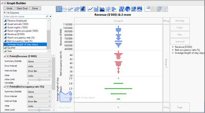
e) Select Average length of stay (days), then drag it to the Y zone below Bed occupancy rate.
f) Select Date and drag it to the X zone.
g) Remove the smooth curve by clicking the second button from the left on the Elements bar.
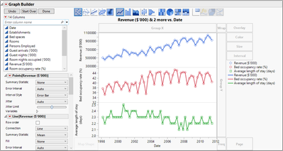
h) Press and hold the Shift key and click the Line element on the Elements bar.
Note that if you change to the Line element without keeping the Points element, the Legend might not show the Points. You can bring back the Points in the Legend by clicking the red triangle next to Graph Builder, selecting Legend Settings, then selecting the checkboxes next to the Points.
i) Right-click on legend item for Revenue, select Marker, then select the open diamond marker.
j) Right-click the legend item for Bed Occupancy, select Marker, then select the open circle marker.
k) Right-click the legend item for Average length of stay, select Marker, then select the open square marker.
l) Click Done.
m) Click the graph title and enter Tourism Trends.
n) Click the red triangle next to Graph Builder and select Show > Legend.
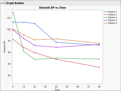
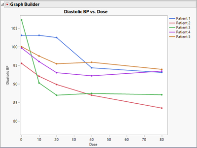
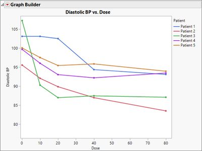
2. Open the Dose Response data table and create the following graph.
a) Open Dose Response.jmp.
b) Select Graph > Graph Builder.
c) Drag Dose to the X zone.
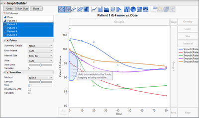
d) Drag Patient 1 to the Y zone.
e) Drag Patient 2, Patient 3, Patient 4, and Patient 5 to the Y zone, dropping just inside the axis to add the variables.
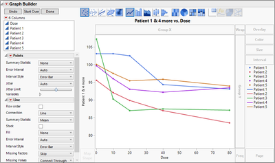
f) Remove the smooth curve by clicking the Smoother element in the Elements bar.
g) Press and hold the Shift key and click the Line element in the Elements bar.
Note that if you change to the Line element without keeping the Points element, the Legend might not show the Points, so the next steps are unnecessary.
h) Click Done.
i) Click the title and enter Diastolic BP vs. Dose.
j) Click the Y axis label and enter Diastolic BP.
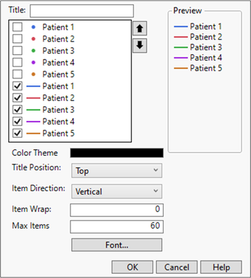
k) Click the red triangle next to Graph Builder and select Legend Settings.
l) Deselect the first five checkboxes.
m) Click OK.
An alternate solution is to first stack the data, then use the new Patient column in the Overlay role.
a) Return to the Dose Response data table.
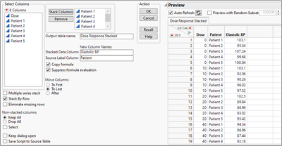
b) Select Tables > Stack.
c) Select Patient 1 through Patient 5, then click Stack Columns.
d) In Output table name, enter Dose Response Stacked.
e) In Stacked Data Column, enter Diastolic BP.
f) In Source Label Column, enter Patient.
g) Click OK.
h) Select Graph > Graph Builder.
i) Drag Diastolic BP to the Y zone.
j) Drag Dose to the X zone.
k) Drag Patient to the Overlay zone.
l) Remove the Smoother and add the Line element as before.
m) Click Done.
n) Change the Legend Settings as before.
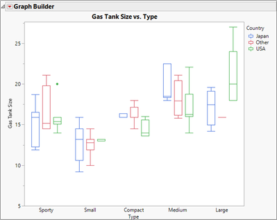
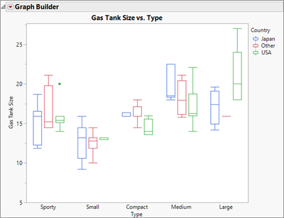
3. Open the Car Physical Data data table and create the following graph.
a) Open Car Physical Data.jmp.
b) Select Graph > Graph Builder.
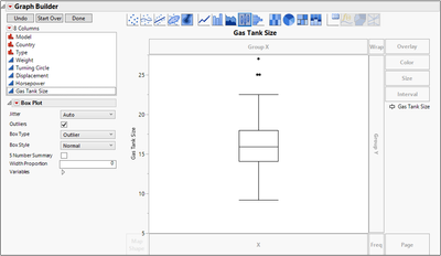
c) Drag Gas Tank Size to the Y role.
d) Click the box plot element on the Elements bar.
e) Drag Type to the X role.
f) Drag Country to the Overlay role.
g) Click Done.
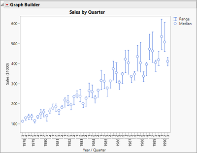
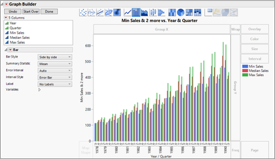
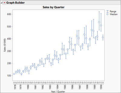
4. Open the Sales by Quarter data table and create the following graph.
a) Open Sales by Quarter.jmp.
b) Select Graph > Graph Builder.
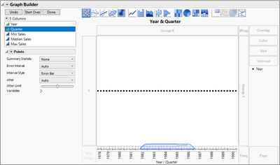
c) Drag Year to the X axis.
d) Drag Quarter to just inside the X axis, to nest Quarter within Year.
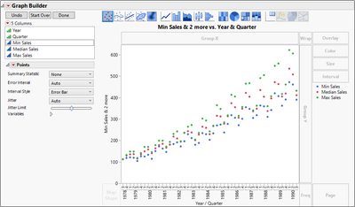
e) Drag Min Sales, Median Sales, and Max Sales to the Y zone.
f) Click the Bar element on the Elements bar.
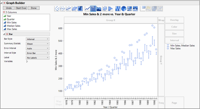
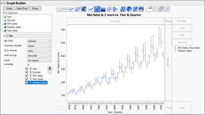
g) In the Control Panel, click the drop-down next to Bar Style and select Interval.
h) Open the Variables outline, select Median Sales, then click the down arrow.
Note that there are other ways to drag variables to zones to get the same graph.
i) Click Done.
j) Click the graph title and enter Sales by Quarter.
k) Click the Y axis label and enter Sales ($1000).
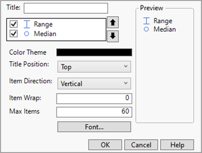
l) Click the red triangle next to Graph Builder and select Legend Settings.
m) Double-click Min Sales…Max Sales and enter Range.
n) Double-click Median Sales and enter Median.
o) Click OK.
Level 2
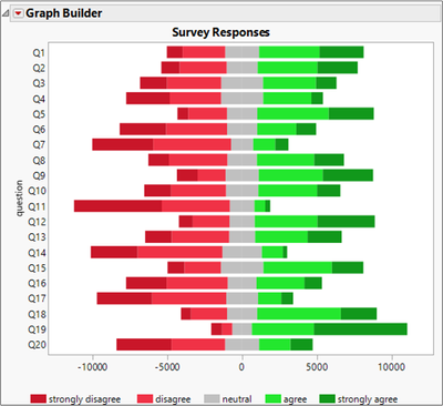
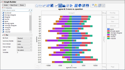
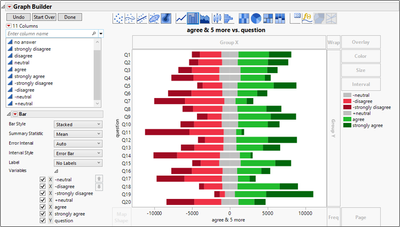
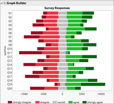
5. Open the Likert Survey data table. Examine the columns, especially notice the formula columns, then create the following graph.
a) Open Likert Survey.jmp.
The first column represents the question number. The next six columns represent the number of respondents to the question. The final four columns are used to build the graph. They were created using formulas on the original columns in order to build the graph. Notice the scale of the X axis and how the strongly disagree and disagree values need to be negative. Also note that the -neutral and +neutral columns will be used to force the gray neutral bar to be centered at zero.
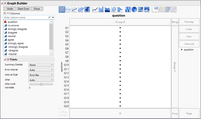
b) Select Graph > Graph Builder.
c) Drag question to the Y zone.
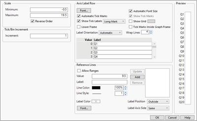
d) Right-click the Y axis and select Axis Settings.
e) Check the Reverse Order box.
f) Click OK.
g) Select agree through +neutral, then drag those six columns to the X zone.
h) Select the bar element on the Elements bar.
i) In the control panel, click the drop-down menu next to Bar Style and select Stacked.
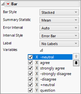
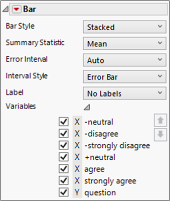
j) In the control panel, open the Variables outline.
k) Select -neutral and click the up arrow four times.
l) Repeat the previous step to order the X variables appropriately: -neutral, -disagree, -strongly disagree, +neutral, agree, strongly agree.
m) Right-click -neutral in the Legend and select Fill Color, then select a light gray.
n) Right-click -disagree in the Legend and select Fill Color, then select a light red.
o) Right-click -strongly disagree in the Legend and select Fill Color, then select a dark red.
p) Right-click +neutral in the Legend and select Fill Color, then select the same light gray.
q) Right-click agree in the Legend and select Fill Color, then select a light green.
r) Right-click strongly agree in the Legend and select Fill Color, then select a dark green.
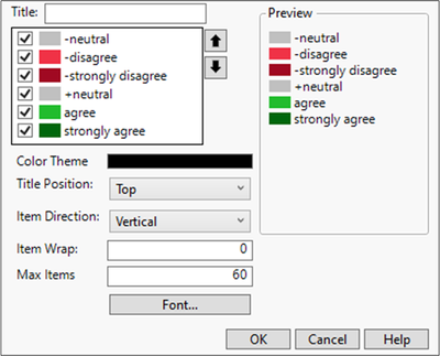
s) Click the red triangle next to Graph Builder and select Legend Settings.
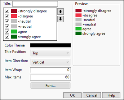
t) Select -strongly disagree, then click the up arrow twice.
u) Select -disagree, then click the up arrow once.
v) Deselect the -neutral checkbox.
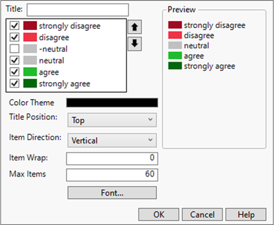
w) Double-click -strongly disagree and enter strongly disagree.
x) Double-click -disagree and enter disagree.
y) Double-click +neutral and enter neutral.
z) Click OK.
aa) Click the red triangle next to Graph Builder and select Legend Position > Bottom.
bb) Click Done.
cc) Select the graph title and enter Survey Responses.
dd) Select the X axis title and hit the backspace to remove it.
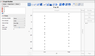
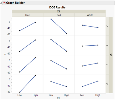
6. The DOE Results data table contains data from a designed experiment. A full factorial (all combinations) of factors X1, X2, X3 was performed, and the response Y for each treatment combination was recorded.
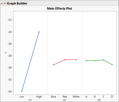
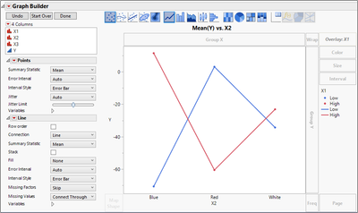
A main effects plot shows the average value of the response at each level of the factors. A two-factor interaction plot shows the average value of the response at each level of two of the factors.
Create graphs to show the main effects and two-factor interaction effects.
a) Open DOE Results.jmp.
b) Select Graph > Graph Builder.
c) Drag Y to the Y zone.
d) Drag X1 to the X zone
e) Drag X2 to the X zone, to the right of X1.
f) Drag X3 to the X zone to the right of X2.
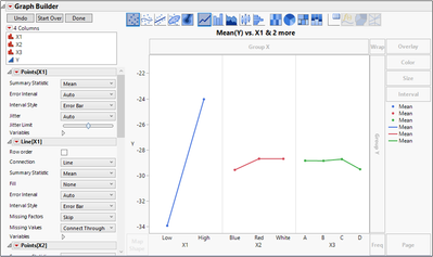
g) Under Points[X1], click the drop-down next to Summary Statistic and select Mean.
h) Repeat for Points[X2] and Points[X3].
i) Press and hold the shift key and select the Line element from the Elements bar.
j) Click Done.
k) Click the graph title and enter Main Effects Plot.
l) Click the red triangle next to Graph Builder and select Show > Legend.
X1 has the biggest main effect. Does the effect of X1 depend on the level of the other two factors? If so, there is an interaction effect.
m) Click Start Over. (Or open a new Graph Builder window)
n) Drag Y to the Y zone.
o) Drag X2 to the X zone.
p) Drag X1 to the Overlay zone.
q) In the control panel, click the drop-down next to Summary Statistic and select Mean.
r) Press and hold the Shift key, then select the Line element from the Elements bar.
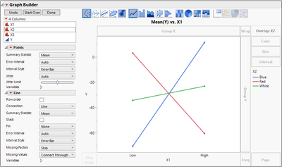
The graph shows that the effect of X2 depends on the value of X1 because the lines are not parallel. (You can test this hypothesis using the Model script in the data table.)
It can be instructive to view the interaction plot with X1 on the X axis and X2 in the Overlay role.
s) Right-click the X axis and select Swap > X1.
The interaction again can clearly be seen. Often one of these two views offers a clearer interpretation of the interaction effect. It is up to you to decide how to best display the effects.
Note that the Fit Least Squares platform automatically generates interaction plots, including static plots like these and interactive plots using the Profiler.
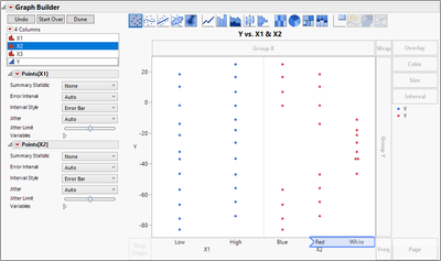
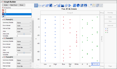
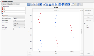
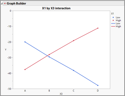
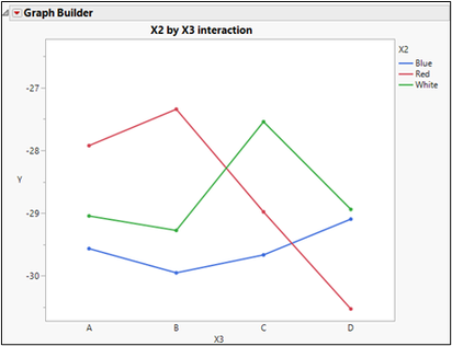
You can use the same steps to create the interaction plots for X1-X3 and X2-X3. Those steps are not shown here, but the graphs are shown below. Also included is a graph that shows all 24 observations using the Group X and Group Y roles.
When building these graphs for a presentation, be sure to click the Done button, give the graph a descriptive title, and perhaps change colors, markers, and the legend for clarity in publication.


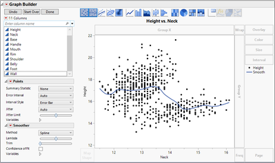
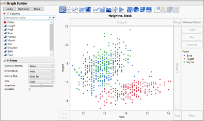
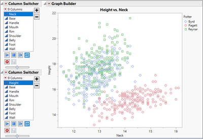
7. The Potter data table contains measurements taken on different examples of pottery jugs from three different potters. Use Graph Builder to make a scatterplot of two of the continuous variables, then switch columns to find relationships that vary depending on the potter.
a) Open Pottery.jmp.
b) Select Graph > Graph Builder.
c) Drag Height to the Y drop zone.
d) Drag Neck to the X drop zone.
e) Drag Potter to the Overlay zone.
f) Click the smoother icon in the Elements bar.
g) Click Done.
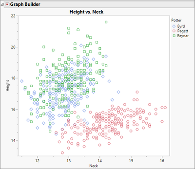
h) Right-click Byrd in the Legend and select Marker, then select the open diamond marker.
i) Right-click Pagett in the Legend and select Marker, then select the open circle marker.
j) Right-click Reynar in the Legend and select Marker, then select the open square marker.
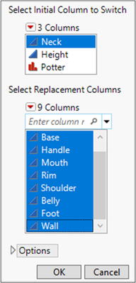
k) Click the red triangle next to Graph Builder and select Redo > Column Switcher.
l) In the Select Replacement Columns box, select all columns.
m) Click OK.
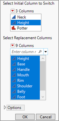
n) Again, click the red triangle next to Graph Builder and select Redo > Column Switcher.
o) In the Select Replacement Columns box, select all columns.
p) Click OK.
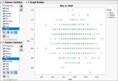
These variables show separation between Pagett and the other two potters. Examine other variables to see where there is more or less separation. Some examples are shown below.

Recommended Articles
- © 2024 JMP Statistical Discovery LLC. All Rights Reserved.
- Terms of Use
- Privacy Statement
- About JMP
- JMP Software
- JMP User Community
- Contact
