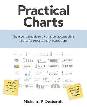
We are delighted to see that data viz expert, Nick Desbarats, founder of Practical Reporting, has released his much-anticipated new book, Practical Charts: The Essential Guide to Creating Clear, Compelling Charts for Reports and Presentations. The “we” here are Mike Anderson, who has taken all of Nick’s data visualization classes and has read many data visualization books, and Anne Milley, who has had the pleasure of hosting Nick on Analytically Speaking and Statistically Speaking. And we’re delighted to see that he mentions our own Xan Gregg, Distinguished Engineering Fellow in JMP R&D, twice on the Acknowledgements page. Clearly, others are also delighted with the book, as evidenced by its many five-star reviews on Amazon.

Nick’s experience as an independent educator, author, and world-renowned data viz expert is evident in this well-organized book. If everyone followed Nick’s guidance, just imagine how much time we could all save in interpreting charts.
Practical Charts is fairly unique among data visualization books in that it is, as the name indicates, practical. Its value comes less from sitting down and reading through it than from having it at your elbow as you work on a chart. It’s a book that was written to be used, not just read.
Even the preface is useful to help frame your thinking about your charts before you create them. After challenging the reader to clearly understand the goal of the chart and its audience, it then explains why that is such a critical step to creating a successful visualization.
After the preface, the balance of the book is broken down into different elements of a chart or chart types. Each chapter has clear examples of good and bad application of the key points that Nick makes, as well as clear guidance for when to use a particular technique or try something else. It does this all while being technology-agnostic: the techniques and concepts Nick puts forward could be applied as easily with a pen and paper as they can in Graph Builder or command-line-based solutions.
We are pleased to offer a free sample chapter for you to download: Six ways to make charts more obvious. We all have limited working memory. By being intentional about designing your charts and answering the questions Nick poses, as well as thinking through design choices, you will help others see what’s important more quickly. We hope you enjoy and share with others so everyone can enjoy more succinct visual communication.
You must be a registered user to add a comment. If you've already registered, sign in. Otherwise, register and sign in.