- JMP User Community
- :
- Blogs
- :
- JMPer Cable
- :
- New in Graph Builder for JMP 16
- Subscribe to RSS Feed
- Mark as New
- Mark as Read
- Bookmark
- Subscribe
- Printer Friendly Page
- Report Inappropriate Content
Here's a quick tour of many of the enhancements made to Graph Builder in JMP 16.
|
|
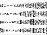
Density Random is a new jitter option in the Points element, and it's the default whenever the number of dots is too many for the Centered Grid option. It's like Random Uniform, but the points are constrained to an envelope corresponding to a kernel density function (like a violin plot). |
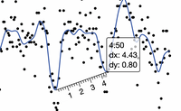 |
A new Ruler tool is available for all graphs in JMP, not just Graph Builder. It's useful to measure the size of or distance between features, such as the low points in this example. As you make measurements, the results are written to the log. |
 |
The Heatmap element now supports hexagonal binning. Hexagons are better than rectangles in many cases since they approximate a circle better for binning nearness and represent diagonal patterns with less pronounced aliasing. |
|
|
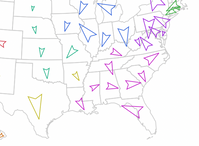
With a little scripting, you can create your own custom marker shapes for use in the Points element, dependent on any number of other variables in the data table. In this example, the arrow is a custom polygon which incorporates the ratio of two crime statistics to determine its direction. |
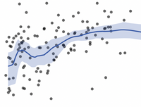 |
The Smoother element has many more choices for smoothing functions. In addition to the existing spline smoothers, there are now loess, Savitzky-Golay and moving average smoothers with many options themselves. Having moving average as a smoother, instead of a separate formula column allows it to follow the Local Data Filter and the Graph Builder grouping variables. |
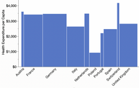 |
Categorical axes now have a Size By property, which allows another variable to control the spacing of the labels. In this example, the bar widths are based on country population for a result sometimes called "mekkobars" since they resemble a mosaic or "marimekko" chart. |
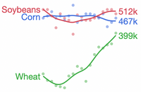 |
Lines can now be labeled with key information: the first, last, minimum and maximum values, plus the overlay name. Labeling with the name can eliminate the need for a legend, and labeling key values can highlight important anchoring information without overload. |
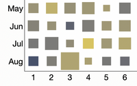 |
The size of the filled area in heatmaps can now be scaled by a separate variable. The same applies to hexagonal heatmaps, and it's a useful way of showing counts of a cell when the color represents some other variable. |
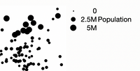 |
The legends for size variables are explicit now, showing the actual marker sizes and the range of values. |
And there are lots more new features that don't fit into a thumbnail image:
- A new Summary Statistic option provides cumulative sums, which saves on adding a separate formula column and works better with filtering.
- The legend can be dragged to anywhere in the graph, not just the predefined corners.
- Run charts are easier to create. Instead of manually adding the row number to the X axis, you can leave it empty and choose the Row Order option on the Line element.
- The box plot element has more drawing options to match the Distribution platform.
- There's quick access to custom axis label reordering, right from the axis.
- Custom shape files are easier – specify them right on the shape variable in Graph Builder instead of as a column property in the data table.
- Bar labels can be moved with the mouse.
- Date/time variables can have their granularity adjusted for aggregation and wrapping directly from the graph.
Finally, I'm excited about one new JMP graphics feature that only affects platforms outside of Graph Builder. Analyses like Control Charts that have semantic colors for bad-to-good now rely a preference for those colors instead of hard-coding red and green, so you can choose something more accessible if you like.
- © 2024 JMP Statistical Discovery LLC. All Rights Reserved.
- Terms of Use
- Privacy Statement
- About JMP
- JMP Software
- JMP User Community
- Contact

You must be a registered user to add a comment. If you've already registered, sign in. Otherwise, register and sign in.